Wednesday 30 June 2021

Help us protect your account Microsoft has enabled Security Defaults to keep your account secure. Learn more about the benefits of Security Defaults


Error:  

Help us protect your account

Microsoft has enabled Security Defaults to keep your account secure. Learn more about the benefits of Security Defaults

Or

Authentication wasn’t successful. Sign in to your Power BI account to view or edit Power BI tiles 


Solution :  Click on "Skip for now"


Navigate to properties > Manage security defaults as shown above. 


Enable security default's to No and save. 


Refresh your screen and login again. Your issue will be resolved


Creating a Power BI Dashboard – A Step by Step Guide

 Data Visualization became an important topic in the lives of many companies in the last couple of years. Data Visualization tools like Power BI allow executives to make important decisions faster while making data operations easier. 

Without setting and processing Data Visualization correctly, it’s had to monitor the efficiency of your sales, advertisement campaigns, business operations and performance of a business in general. To find out more on the subject read our fresh article on What is Data Visualization and Its Role for Business Growth

What is Power BI?

Due to ever-increasing popularity, Data Visualization comes in various shapes and sizes, which means there are currently a lot of Data Visualization tools and software on the market. Together with Tableau, and Google Data Studio, Power BI is a self-service Business Intelligence platform that combines web analytics with Artificial Intelligence capabilities and powerful data visualization. 

Created by Microsoft, it allows turning your Excel sheets into colourful charts for every end-user with the right access without having to rely on data scientists or IT professionals. It also provides a data warehouse, semantic models, an open connectivity framework, and an application lifecycle management (ALM) toolkit.

You can build and transform Power BI dashboards on your desktop – with your Operating System being exclusively Microsoft, or you can enjoy simplified data visualization capabilities on the Cloud using whichever OS you’d like.  

Unlike other more complex data visualization tools and software, Power BI is quite simple in use once you get a hang of it. You don’t need a degree or a background in data science to create a new dashboard in Power BI – just our step-by-step guide from InsightWhale and a love for a crazy adventure 😉

How to develop dashboards in Power BI? 

Since we established how important Data Visualization is in order for a company to become data-driven, here we created a step-by-step guide on Power BI: Creating a Dashboard. 

Let’s begin!

Step 1: Download Power BI Desktop

As with any tool or software, the Power BI dashboard setup starts with signing up with Power BI or if you’ve already logged in, with its installation. To do so go to Power BI home > Sign up free > Start free trial. 

Once you’ve entered your name and work email address, you will be directed to your Power BI desktop homepage, where under My workspace you can find Dashboards, Reports, Workbooks or Datasets if you have any.  

Now to download Power BI Desktop, look at your header and find a download sign ( ⤓ ) > Power BI Desktop or go to https://powerbi.microsoft.com/en-us/desktop/. We remind you that Power BI desktop is only compatible with Windows OS, so if you utilize any other Operating Systems like Linux or Mac OS, then mmmm-m tough luck. 

Step 1: Download Power BI Desktop

Or not so tough as there are plenty of great Data Visualization tools on the market, here’s their comparison, by the way, A Comparative Analysis of Data Visualization Tools: Google Data Studio, Power BI, and Tableau.  

Step 2: Install Power BI Desktop

To install your setup file and go to Next > ☑I accept the terms in the License Agreement > Choose the destination folder > ☑Create a desktop shortcut > Install > ☑Launch Microsoft Power BI Desktop > Finish.

Step 2: Install Power BI Desktop

Step 3: Import data to Power BI Dashboard

Without numbers, there is no data to visualize, so the third step of Power BI dashboard creation is to import data. To do so in your Power BI Desktop Dashboard press on Home > Get Data > Choose a data source > Connect. 

Step 4: Format data in Power BI Dashboard

After you’ve selected your data source, the Power BI dashboard starts processing it and organizes what it has found in the new Navigator window. In the example below, you can see how Power BI found two components displayed on the left side of the window – Document and Ranking of the best and worst states for retirement. 

Select the data that interest you to see a preview. Here you have a perfect chance to format your future Power BI data visualization by choosing Transform Data or press Load to visualize it as it is.

Step 5: Create Data Visualization in Power BI Dashboard

Here’s great news! After importing data to your Power BI dashboard it’s quite simple to create actual data visualization dashboard elements. 

All you have to do is look at your right-hand Fields panel and check or drag-and-drop the desired field, like in this case Abbreviation, Affordability, Overall rank, State or Weather, onto the Power BI dashboard.   

In case you want to create another Power BI dashboard that shows correlations between various values, just check the values you’re interested in visualizing in the Fields section we described below, and Power BI will automatically generate a data visualization. 

You can choose the visualization type by simply clicking on any Bar, Pie or Donut chart or any other Data Visualization methods and types under the Visualizations tab on the right side of the panel.  

Congratulations! You are done! Your Power BI Desktop Dashboard has been created! Keep adding other Power BI charts and graphs to your dashboard with additional visualization types and information until you are ready and the final Power BI dashboard looks something like this.

To help you perfect your dashboard masterpiece we created another article section down below which lists the most useful charts you should consider, you are welcome 🙂

Useful Power BI chart types

Now that you know how data visualization in Power BI dashboards is created, let’s look at great Power BI charts and elements you can use. 

Power BI Slicers

How to create Power BI Slicers

What we most love about data visualization is its ability to be interactive. That means that when you look at the colourful dashboard with the top paid football players, for example, you can click on a specific member and the dashboard will change stats on that exact member accordingly. 

This data visualization function allows dashboards to be extensive in covering a certain topic and contain multi-level information on different aspects you can review within a single report page. 

Here’s how you create a Power BI slicer: Visualizations > Slicer > choose a Field > drag-and-drop on your dashboard into Slicer placeholder. 

Power BI Map visualizations

And map visualizations in Power BI have two different versions – a shape map that focuses on the geographic areas and colour gradation and a bubble map that displays data comparison in a form of different sized bubbles.

To create a Power BI shape map, go to Visualizations > Filled Map > choose a Value > add to the Location bucket.

To create a Power BI bubble map, go to Visualizations > Map > choose a Value > add to the Location bucket.

Power BI Tables and Matrix

A Power BI table is just like any other dashboard table, which you can access by going to Visualizations > Table > Values > play around with Value fields until they are in the same order you’d like to see in the final table.

A matrix is another Power BI table, which according to Power BI itself, “is similar to a table, but it has different category headers on the columns and rows”

To access it go to Visualizations > Matrix. Here you can change column colours, shift row and column totals and much more.

Power BI Scatter chart, Waterfall chart, and Funnel charts

Scatter charts are mostly used to compare two different values between each other, like income to sales, for example. 

To create a Scatter chart, go to Visualizations > Scatter chart > select two fields you’d like to compare > drag-and-drop to the X Axis and Y Axis fields > add a field to the Details bucket to mark how you wish to filter your data. 

For instance, you might want to segment your data by year, month or product when comparing income to sales.

Now Waterfall charts are quite fun because wee-ell they look waterfalls. They are usually utilized to show changes in a single value, like sales, over a period of time. 

To create a Waterfall chart, go to Visualizations > Waterfall charts > choose a time-based Field like a month or year > drag to the Category panel > choose any value, like sales, you want to track over time > drag to the Y Axis

How to create Power BI Waterfall chart
Source

Welcome Power BI Funnel charts! Funnel charts are exactly what they sound like – a great way to display sales funnels or user journeys. 

To create a Funnel chart, go to Visualizations > Funnel. 

Modify colours in Power BI charts 

When it comes to data visualization in Power BI, just like any other data visualization, colours play an important role in highlighting trends and differences, and sometimes you want to modify them. Here’s a quick guide on how to do it.

To change the colour of any Power BI chart or graph click Visualizations > click on the chart you’d like to change > click Paintbrush symbol > Data colours > select a Colour picker to choose any chart colour you’d like. 

You can also change the colour of value or measure, to do so go to Visualizations > click on the value you’d like to change > click on the Three vertical dots. 

Tuesday 29 June 2021

How to Use Advanced Similarity Rules to view similar case suggestions - Dynamics 365


How to Use Advanced Similarity Rules to view similar case suggestions

Advanced Similarity Rules support the customers to view similar case suggestions in the Customer Service Hub. This allows users to view cases similar to their current case and resolve customer issues in the first contact and within a short period. It also helps to reduce operating costs and in turn, increases customer satisfaction.

If the user is working on a support case, he can view similar cases in the Related section of the current case and resolve their case quickly.

Steps to create a new similarity rule

Step 1: In the Customer Service Hub Sitemap, Go to Service Management.

Advanced Similarity Rules to view similar case suggestions

Step 2: Click on Advanced Similarity Rules.

Advanced Similarity Rules to view similar case suggestions

Step 3: Select New on the command bar to create an advanced similarity rule.

Advanced Similarity Rules to view similar case suggestions

Step 4: In the Details tab, fill all the required details.

  1. Name (Required): Enter the name of the rule.
  2. Source Entity (Required): By default, Case entity is selected for similar case suggestions.
  3. Description (Optional): Used to show a description of the similarity rule.
  4. Noise Key Phrases (Optional): Users can provide noise key phrases separated by a semicolon (;). These phrases will be filtered while searching for a similar case.
  5. Filter Results by Status (Optional): Select the status based on the requirement for filtering records, example -Active, Cancelled, Resolved.

Step 5: Click on Save to save the rule.

Advanced Similarity Rules to view similar case suggestions

Step 6: In the Match Fields tab, click on + New Text Analytics Entity Mappings to add related text analytics entity mapping records to this rule. Fill all the details in the Details tab in the new record.

1. Criteria: Select criteria for matching records i.e. Exact Match or Text Match.

Advanced Similarity Rules to view similar case suggestions

1.1. Exact MatchAll fields except single-line and multi-line text fields can be enabled for an exact match.

How to enable the field for exact matching of similar records.

Follow the below steps to enable a field for the exact match of similar cases.

    1. Navigate to https://make.powerapps.com/
    2. Go toEntities, then select the entity you want to customize, and then select Views.
    3. Open Quick Find view of the entity with name Quick Find <Entity name>Advanced Similarity Rules to view similar case suggestions
    4. On the right-hand side, click on Edit Find Column
    5. Select the fields you want to enable for an exact match.Advanced Similarity Rules to view similar case suggestions
    6. Select Apply and click on Save
    7. Select Publish to finish enabling exact matching for the field.

1.2. Text Match: Text in selected fields is used for finding key phrases to match. For example, if you select Case Title or Description, text in these fields will be matched.

2. Entity (Required):  Choose an entity from the drop-down list to be used to find matching records.

Advanced Similarity Rules to view similar case suggestions

3. Field (Required): Select the field to be used to create a text search rule to find matching target records. Two types of fields are used for similarity analysis.

3.1. Exact match fields: Used for an exact match on a field to field basis. All fields except Multiple Lines of Text are available for an exact match. Each field can be used only once.

3.2. Text Match fields: Only fields of type Text or Option Set are available.

Advanced Similarity Rules to view similar case suggestions

Step 7: Click on Save to save the rule.

Advanced Similarity Rules to view similar case suggestions

Step 8: Select Activate from the command bar to activate the rule.

View Similar Case Suggestions in the Customer Service Hub Model Driven App

Users can view similar case suggestions in the Related section of the Case entity record in the Customer Service Hub.

  1. In the Customer Service Hub, navigate to ServiceCases and open a Case
  2. You will see the Similar Cases in the Related section of the Case entity record based on the Advanced Similarity Rule.Advanced Similarity Rules to view similar case suggestions

Conclusion: With the help of advanced similarity rules, users can now view cases similar to the current case and resolve customer issues within minimal time.

Monday 14 June 2021

Console code - dynamics CRM - latest working

Console code - dynamics CRM - latest working
You need to create a azure app and enable permission to use the crm environment. 

App Id is the "azure app" id that you have created in azure. 


using Newtonsoft.Json;
using Newtonsoft.Json.Linq;
using System.Net.Http;
using System.Net.Http.Headers;
using Microsoft.IdentityModel.Clients.ActiveDirectory;
using System.Net;
using System.Threading.Tasks;
using System;
using Microsoft.Xrm.Tooling.Connector;
using Microsoft.Crm.Sdk.Messages;

class program
{

    static void Main(string[] args)
    {
       
        string url = "https://org72e95421.crm.dynamics.com";
     
        string userName = "user@5521.onmicrosoft.com";
 
        string password = "pass@123";

        string conn = $@"
    Url = {url};
    AuthType = OAuth;
    UserName = {userName};
    Password = {password};
    AppId = 77c8a4be-1cf1-4022-8ff9-f03c9e88b3b3;     
    RedirectUri = https://localhost;
    LoginPrompt=Auto;
    RequireNewInstance = True";

        using (var svc = new CrmServiceClient(conn))
        {

 if (svc.IsReady)
            {
                var myContact = new Entity("contact");
                myContact.Attributes["lastname"] = "Test";
                myContact.Attributes["firstname"] = "ram";
                svc.Create(myContact);
                Console.WriteLine("created contact");
            }


            WhoAmIRequest request = new WhoAmIRequest();

            WhoAmIResponse response = (WhoAmIResponse)svc.Execute(request);

            Console.WriteLine("Your UserId is {0}", response.UserId);

            Console.WriteLine("Press any key to exit.");
            Console.ReadLine();
        }
    }
}


Deep Dive into PCF - PowerApp Control Framework, a step by step tutorial

What is PCF?

PCF Tutorial Dynamics 365 : PCF (PowerApps component framework) empowers professional developers and app makers to create code components for model-driven apps and canvas apps (experimental preview) to provide an enhanced user experience for the users to view and work with data in forms, views, and dashboards. For example:

  • Replace a field that displays a numeric text value with a dial or slider code component.
  • Transform a list into an entirely different visual experience bound to the data set like a Calendar or Map.

Developing a custom control

PowerApps component framework to create code components that can be used across the full breadth of PowerApps capabilities. Unlike HTML web resources, code components are rendered as a part of the same context, load at the same time as any other components, providing a seamless experience for the users. Developers can bundle all the HTML, CSS, and TypeScript or JavaScript files into a single solution package file. Code components can be reused many times across different entities and forms.

Code components have access to a rich set of framework APIs that expose capabilities like component lifecycle management, contextual data and metadata access, seamless server access via Web API, utility and data formatting methods, device features like camera, location and microphone, along with easy-to-invoke UX elements like dialogs, lookups, and full-page rendering.

Developers and app makers can use modern web practices and also harness the power of external libraries to create advanced user interactions. The framework automatically handles the component lifecycle, retains application business logic, and optimizes for performance (no more async IFrames). Component definition, dependencies, and configurations can all be packaged into a solution and moved across environments and can be shipped via AppSource.

Your first control

Prerequisites

First you will need to install the following:

Initialize the project

Open a command prompt and go to the folder where you want to create the PCF solution. Launch the following command:

 pac pcf init  --namespace <namespace for the component> --name <name of the component> --template <component type

Currently, PowerApps CLI supports two types of components: field and dataset for model-driven apps. For canvas apps, only the field type is supported for this experimental preview.

Let’s create a field type. The project is created.

PCF Tutorial Dynamics 365

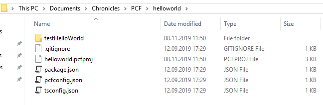
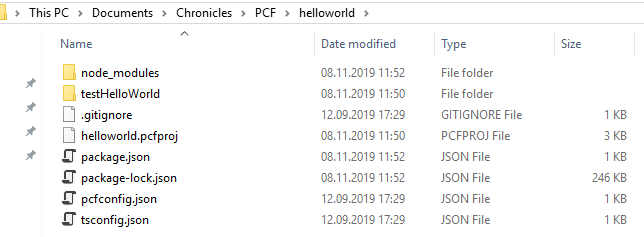
To install the project dependencies, you have to run this command : npm install 

The node_module folder is created containing all the dependencies.

PCF Tutorial Dynamics 365

Develop your component

Open Visual Studio. Create a new project -> create a blank solution.

PCF Tutorial Dynamics 365

Right click on the solution -> Add -> Existing Web Site

PCF Tutorial Dynamics 365

In this example, we will display the id of the current object. You then will need to access the Xrm object to use the CRM function.

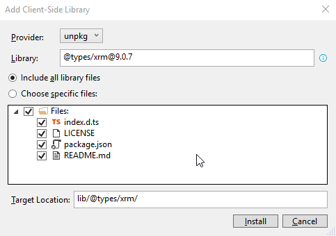
Right-click on the project -> Client-Side library

Add the @types/xrm@9.0.7 library

PCF Tutorial Dynamics 365

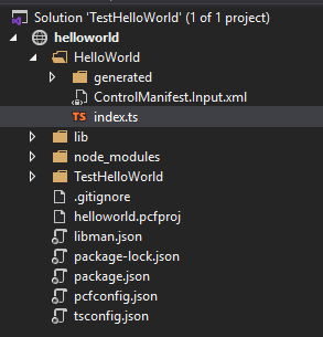
Open index.ts located in the folder project created. It’s in this file that the main code is located.

PCF Tutorial Dynamics 365

For our example, we first need to add some global variables below the class definition.

private _labelElement: HTMLLabelElement;¨
private _container: HTMLDivElement;
private _context: ComponentFramework.Context<IInputs>;

In the Init() method, add the following code:

this._context = context;
this._container = container;
this._labelElement = document.createElement("label");
this._labelElement.setAttribute("id", "labelID");
this._labelElement.innerHTML = "NA";
this._container.appendChild(this._labelElement);

and in the in the UpdateView() method, add the following code:

this._context = context;
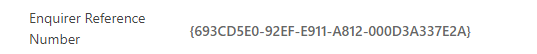
this._labelElement.innerHTML = Xrm.Page.data.entity.getId();

Build and run

From the command prompt, run npm run build to build your project. If everything’s fine, it will create a “out” folder with the controls.

To test your control, run npm start. The controls will be opened in your favourite browser.

PCF Tutorial Dynamics 365

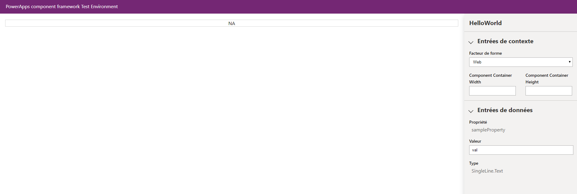
You can notice that NA is displayed in the field. Indeed, the UpdateView using the getId function of Xrm, it will display the Id only when the control will be deployed in the CRM. Let’s do that.

Deploy the controls

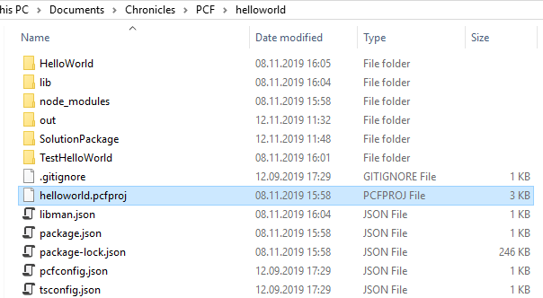
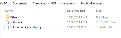
First you need to create a folder “SolutionPackage” in order to hold the solution and go in it:cd SolutionPackage

If you downloaded an existing PCF, this folder sometimes already exists.
You can easily check if there is a folder with a .cdsproj file inside. 
If so, then go directly to the step below to generate the zip file with the MSBUILD command.

Then run the following in the command prompt to define the publisher name and prefix and initialize the solution files creation:

pac solution init --publisher-name [publisher name] --publisher-prefix [publisher prefix]

PCF Tutorial Dynamics 365

pac solution add-reference --path [path to pcfproj file]

path to pcfproj file = reference of the below path:

PCF Tutorial Dynamics 365

You should have something like:

PCF Tutorial Dynamics 365

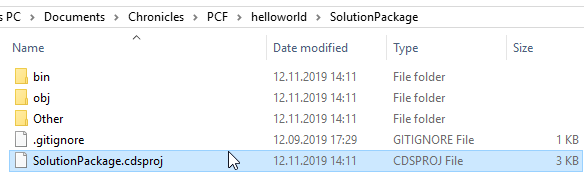
It should have update the .cdsproj in the SolutionPackage folder:

PCF Tutorial Dynamics 365

Once again, If you downloaded an existing PCF, you have to check if the folder node_modules exists in the root folder (the one with the the .cdsproj file).
If not, open your console on this folder and run the command: npm install
This will install all required modules and their dependencies into a folder called node_modules.

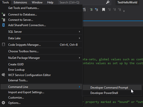
To generate Zip File, open the Developer Command Prompt for Visual Studio and go to SolutionPackage folder.

PCF Tutorial Dynamics 365

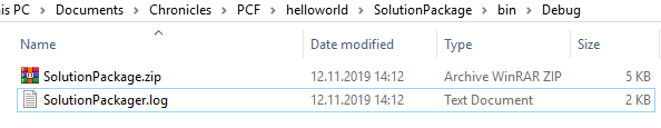
Then run the below command:

  • MSBUILD /t:restore
  • MSBUILD

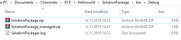
This adds the Solution zip in the bin Debug folder.

PCF Tutorial Dynamics 365

By updating the cdsproj file, you can generate both managed and unmanaged solution

PCF Tutorial Dynamics 365

Uncomment and modify the node below to “Both” and relaunch MSBUILD.

  <PropertyGroup>
    <SolutionPackageType>Both</SolutionPackageType>
  </PropertyGroup> 

You can see the both solutions:

PCF Tutorial Dynamics 365

Import and use your control

Now you can import the solution into dynamics. Don’t forget to publish the customization.

Then just open a form and the field you want to apply. Go to controls tab -> Add control.

Choose your new control in the list -> Select it -> Add.

PCF Tutorial Dynamics 365

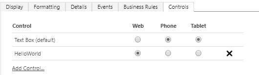
Now you can choose on which device you want it to be displayed. Once again, publish the customization and normally, you should see your controls on the chosen form.

PCF Tutorial Dynamics 365

To update the control, change the version for it in the ControlManifest.Input.xml.

PCF Tutorial Dynamics 365


Configure Manifest file

This is a very important file. It contains your component’s definition. Open this file to start customizing your component.

The control node

This node contains the definition of the control. Here is an example:

<control namespace="ELCAComponents" constructor="PhoneParser" version="1.0.0" display-name-key="PhoneParser" description-key="PhoneParser description" control-type="standard">

The following are the attributes of control tag:

  • namespace: this was provided earlier in the pac command
  • constructor: this is the name of your control that you had provided in the pac command
  • version: change it if needed. If you want to update your component, wou will need to change the version.
  • display-name-key: change it to be the display name (no spaces) of your custom control
  • description-key: change it to be the description of your custom control that you want to show in D365
  • control-type: do not change this

The property nodes

The property nodes, as its name says, contains the properties of your control.

Following are the attributes of property tag:

  • name: change it to be the name of the property
  • display-name-key: change it to be the display name (no spaces) of your property
  • description-key: change it to be the description of your property that you want to show in D365
  • of-type: if your control is going to support only single data-type then use of-type attribute. Valid values are:
    • Currency
    • DateAndTime.DateAndTime
    • DateAndTime.DateOnly
    • Decimal
    • Enum
    • FP
    • Multiple
    • Optionset
    • SingleLine.Email
    • SingleLine.Phone
    • SingleLine.Text
    • SingleLine.TextArea
    • SingleLine.Ticker
    • SingleLine.URL
    • TwoOptions
    • Whole.None
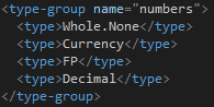
  • of-type-group: if your control is going to support multiple data-type then use of-type-group attribute. If you use this attribute, then you must define the type-group tag and the name of that type-group should be mentioned here. Below is a sample for defining a type-group.

PCF Tutorial Dynamics 365

  • usage: This fields can have three values: bound, input or output. The usage attribute identifies if the property is meant to represent an entity attribute that the component can change (bound) or read-only values (input) 
  • required: If the property is required or not

Quick example

In any case, you will need at least one property. It will represent the control you want to affect. Let’s take a component which aims to change the phone number field format.

<property name="PhoneNumber" display-name-key="PhoneNumber" description-key="Property_Desc_Key" of-type="SingleLine.Text" usage="bound" required="true" />

This above node represents the text field where we want to apply the control. When you will set a textfield with the component, this property will automatically be filled in with the selected field.

PCF Tutorial Dynamics 365

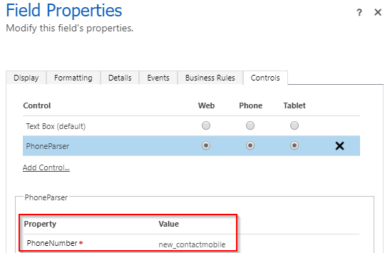
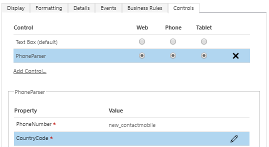
Then, we want to change the phone format following another field containing the country code. The idea is to define another property which will contain the name of the country property.

<property name="Country" display-name-key="CountryCode" description-key="Property_Desc_Key" of-type="SingleLine.Text" usage="input" required="true" />

You can notice the use of usage=”input”. When applying the component, a required string will be then required.

PCF Tutorial Dynamics 365

TypeScript side, you can access the value through the context using the name of the property.

var countryFieldname = this._context.parameters.Country.raw;

The resources node

To implement your control, you may need to add other file like css. By default, a code node pointing to the index.ts file is present.

The resources node lists three type of child tags; code, css & resx.

  • code: it contains the relative path to the typescript file that will contain the code for our custom control
  • css: it contains the relative path of the css file that our custom control will use while rendering the controls
  • resx: it contains the relative path of resx file that will contain localized string
<code path="index.ts" order="1"/>
<css path="css/index.css" order="1" />
<resx path="strings/Tags.1033.resx" version="1.0.0" />

The TypeScript file

The index.ts contains all the implement logic. You can open it with your favourite development tool. By default, the file contains 4 main methods:

  • init: this will be the first method that system will invoke. All your design should happen in this method
  • updateView: this method is invoked when property bag is changed; which includes fields, data-sets, global variables such as height and/or width
  • getOutputs: this method is called prior to receiving any data
  • destroy: add your cleanup code here

Here is a brief description of the params you can find in the init method for example:

  • Context: The entire property bag available to control via Context Object; It contains values as set up by the customizer mapped to property names defined in the manifest, as well as utility functions.
  • NotifyOutputChanged: A callback method to alert the framework that the control has new outputs ready to be retrieved asynchronously.
  • State: A piece of data that persists in one session for a single user. Can be set at any point in a controls life cycle by calling 'setControlState' in the Mode interface.
  • Container: If a control is marked control-type='standard', it will receive an empty div element within which it can render its content.

If you need to import a specific js library, you will need to install it with npm

npm install libphonenumber-js

and then add a reference on the top of the TypeScript page

import { parsePhoneNumber } from 'libphonenumber-js';

Conclusion

Personal advantages / disadvantages

Following my personal short experience with PCF, I noticed the next advantages:

  • As the use of Visual Studio is recommended, it is really easy to import any library directly with this tool.
  • Thanks to the Microsoft PowerApps Command Line Interface CLI, we can generate managed and unmanaged solution ready to be imported.
  • We have the possibility to test our component locally.

But also some disadvantages:

  • It is hard to debug when you need to access CRM element through your control. I had to import the solution each time I wanted to test.
  • Visual Studio detects ghost errors during dev.

Limitations

With the release of PowerApps component framework, you can now create your own code components to improve the user experience in model-driven apps and canvas apps. Even though you can create your own components, there are some limitations that restrict developers implementing some features in the code components. Below are some of the limitations:

  • Only the field type of components is supported in the experimental preview for canvas apps and not the dataset type components.
  • Common Data Service dependent APIs, including WebAPI along with few other APIs, are not available for this experimental preview. For individual API availability for this experimental preview release, see PowerApps component framework API reference.
  • Code components should bundle all the code including external library content into the primary code bundle. To see an example of how the PowerApps command line interface can help with bundling your external library content into a component-specific bundle, see Angular flip component example.

Note

  • Defining multiple components in a single manifest file is not yet supported. 
  • Calling out processes and actions are not supported yet. You can only call dialog boxes using the Navigation method. 
  • Calling one component from another code component is not yet supported.
  • Currently font resource (.tff) is not yet supported.


Thanks

Git Basic working

  Develop = dev   r